Hiro
The Hiro Bikes website offers a user-friendly platform for cycling enthusiasts & newcomers.

Overview
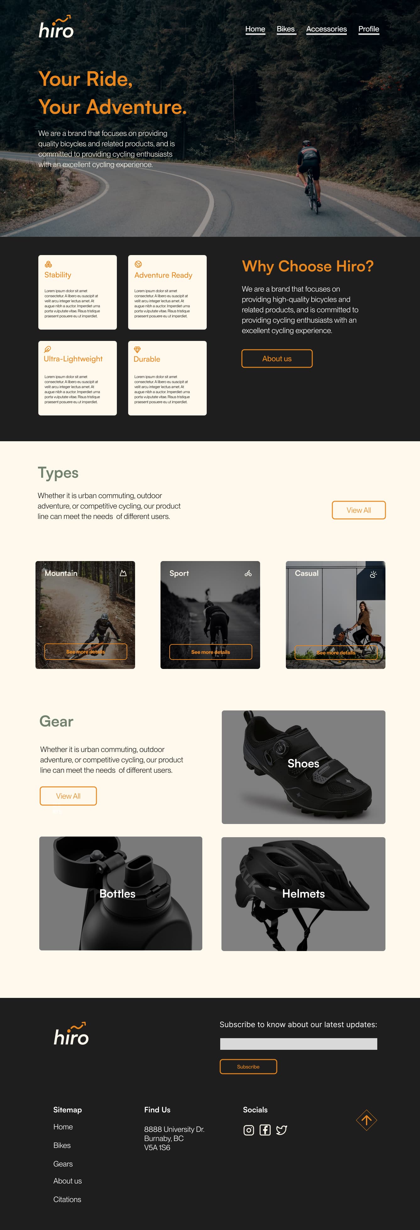
The Hiro Bikes website was developed as the second major project for IAT 339: Web Development, focusing on creating a seamless and user-friendly e-commerce platform for cycling enthusiasts. The project emphasizes responsive design, ensuring the site adapts beautifully and functions optimally across desktops, tablets, and smartphones. As I was the main developer and designer, I showcased a curated selection of bike models, including road, mountain, sport, and casual bikes, using high-quality images and concise descriptions across various screen sizes.
Goal
I needed to design a website to adapt to various screen sizes without compromising usability or design.
Process
Design Objectives
My role ensured a seamless and engaging shopping experience across devices, showcasing products effectively while promoting Hiro’s brand values. By designing and coding the homepage, I created a visually appealing and intuitive interface that adapts to various screen sizes, allowing users to explore Hiro’s bicycles effortlessly.
Design
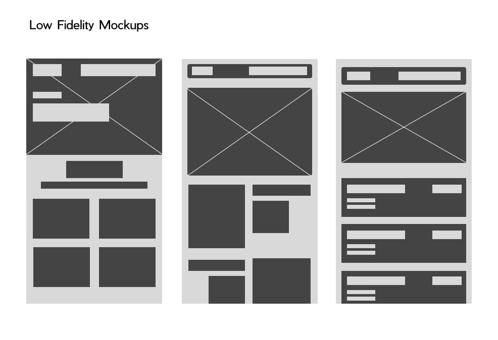
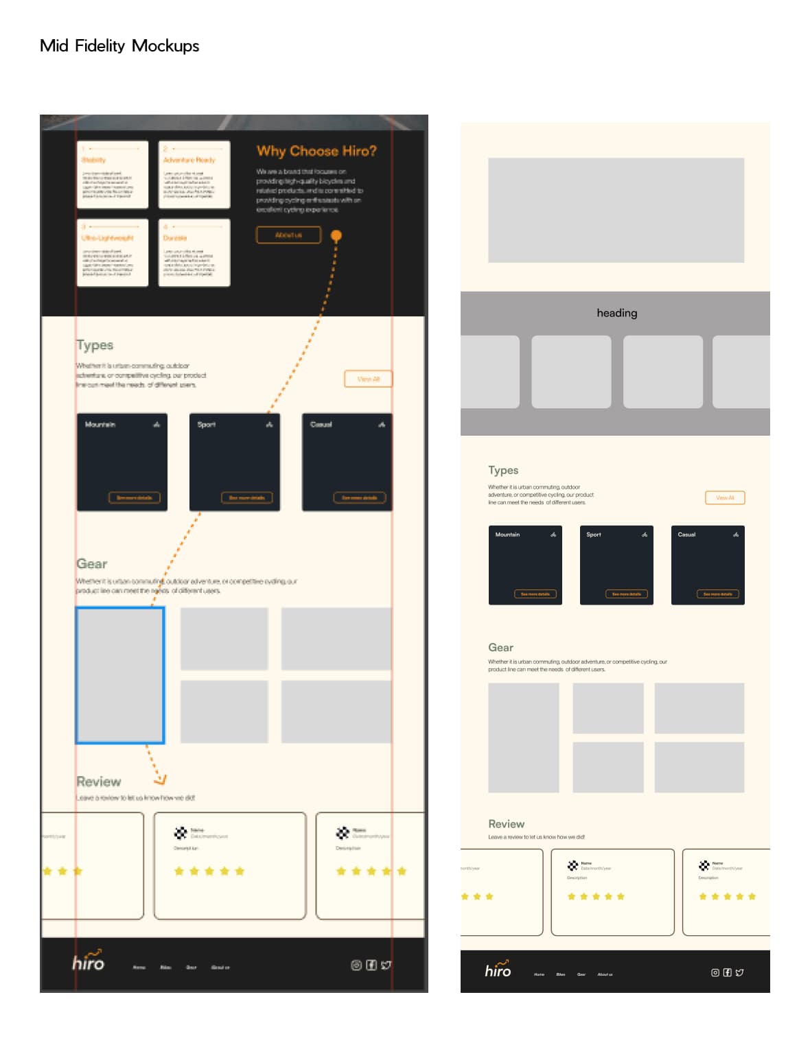
Before coding, I first designed pages to fit seamlessly across mobile to desktop resolutions. Using tools like Figma, I created low-fidelity mockups to illustrate my initial ideas and ensure a smooth transition to development.
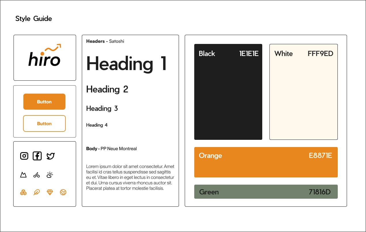
Style Guide
A style guide ensures consistency across design elements, strengthens brand identity, and streamlines the design and development processes. It supports effective collaboration by providing a clear reference, ensuring new features align with the existing design. By promoting cohesive visuals, enhancing the user experience, and improving accessibility, the style guide simplifies scaling and supports future updates, maintaining professionalism and efficiency in my projects.
Challenges
With just one month to design and code Hiro Bikes, I faced several challenges. Managing high-resolution SVGs was tricky as they needed resizing and testing to stay sharp on small screens without appearing oversized. Creating an intuitive hamburger menu that balanced aesthetics and functionality across devices was also difficult. Additionally, maintaining consistency in fonts, buttons, and colours across layouts required careful attention to align with the style guide and ensure visual balance. These experiences underscored the need for growth in design and problem-solving.
Reflection
This project enhanced my skills in responsive design, visual consistency, and aligning elements with brand values, while creating a user-focused mindset. Challenges with high-resolution SVGs, intuitive menu design, and maintaining cohesive layouts revealed areas for growth, motivating me to refine my precision and explore scalable, accessible techniques. Moving forward, I aim to improve accessibility, ensure balanced designs across devices, and leverage advanced tools for consistency, ready to tackle new challenges and create impactful user-centered designs.